If you have ever printed a design and the colors looked off, you are not alone. This usually comes down to RGB vs CMYK.
These two color modes work in very different ways. One is built for screens. The other is built for print. If you use the wrong one, your colors will shift.
This guide explains the difference in plain terms and shows what actually happens when your file goes to print.
Quick Answer
RGB is used for screens. CMYK is used for print.
RGB creates color with light. CMYK creates color with ink. Because of this, RGB can show brighter colors than CMYK. When you print an RGB file, those bright colors often look dull.
What is RGB?
RGB stands for Red, Green, and Blue.
Screens use RGB to create color by mixing light. This includes:
- Phones
- Laptops
- TVs
- Tablets
RGB has a wide color range. It can display bright blues, greens, and neon tones that look sharp on screen
What is CMYK?
CMYK stands for Cyan, Magenta, Yellow, and Black.
Printers use CMYK to create color by layering ink on paper. This applies to:
- Business cards
- Posters
- Banners
- Racing bibs
CMYK has a smaller color range than RGB. Some colors cannot be reproduced exactly in print
Why RGB Looks Better on Screen
RGB uses light. That is the key difference.
Screens emit light, so colors appear bright and vivid. When you increase brightness on a screen, colors become more intense.
CMYK does not work this way. It relies on ink printed on paper. Paper reflects light instead of producing it. This limits how bright the colors can appear.
This is why a design can look bold on your screen but softer once printed.
Why Your Prints Look Dull
This is the most common issue people run into.
When you design in RGB and send the file for print, it must be converted to CMYK. During that process, some colors cannot be matched.
Common examples:
- Bright blues turn darker
- Neon greens become muted
- Deep blacks can look washed out
Ink also plays a role. Paper absorbs ink, which reduces vibrancy. Coated paper holds color better than uncoated paper, but it still cannot match RGB brightness.
What Happens When You Print an RGB File
Most printers will convert your file automatically.
This sounds helpful, but it can lead to problems:
- Colors shift without warning
- Contrast changes
- Brand colors become inconsistent
You may not notice these changes until the job is printed.
That is why relying on automatic conversion is risky.
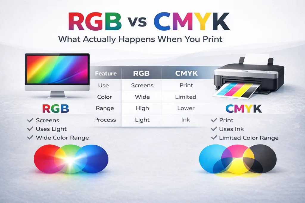
RGB vs CMYK (Side-by-Side)
| Feature | RGB | CMYK |
|---|---|---|
| Use | Screens | |
| Color Range | Wide | Limited |
| Brightness | High | Lower |
| Process | Light | Ink |
| Best For | Digital content | Printed materials |
When to Use RGB vs CMYK
Use RGB when your design will stay on screen:
- Websites
- Social media
- Digital ads
- Presentations
Use CMYK when your design will be printed:
- Business cards
- Flyers
- Banners
- Racing bibs
If the final product is physical, design in CMYK from the start.
How to Get Better Print Colors
If you want your prints to match your expectations, follow these steps:
- Design in CMYK, not RGB
- Avoid neon or overly bright colors
- Use high-resolution images
- Request a proof before printing
- Work with a print shop that checks your files
These steps reduce surprises and improve consistency.
Common Mistakes to Avoid
Many print issues come from simple mistakes:
- Designing everything in RGB
- Designing and printing website content
- Expecting screen colors to match print
- Not checking color values before sending files
- Ignoring proofing
Fixing these early saves time and cost.
RGB to CMYK Conversion Explained
When you convert RGB to CMYK, the software adjusts colors to fit within CMYK limits.
This often changes:
- brightness
- saturation
- tone
After conversion, you should review and adjust your design. Do not assume the colors will stay the same.
Why This Matters for Your Print Projects
Color accuracy affects how your brand is seen.
If your colors shift:
- your design may look inconsistent
- your message may lose impact
- your materials may not match across different prints
This matters for:
- marketing materials
- signage
- event graphics
Getting color right helps your work look professional.
Final Answer
RGB is best for screens. CMYK is required for print.
If you design in RGB and print the file, your colors will change. If you want consistent results, design for the final output from the start.
Need Help Preparing Files for Print?
At Grafix Media, we check your files before printing and flag issues that could affect color or quality. You get a proof before production so you know what to expect.
If you are unsure about RGB vs CMYK, send your file and we will guide you through it.